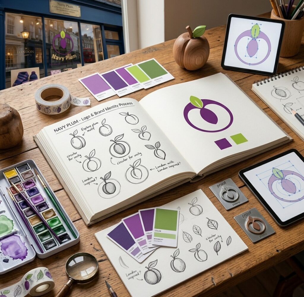
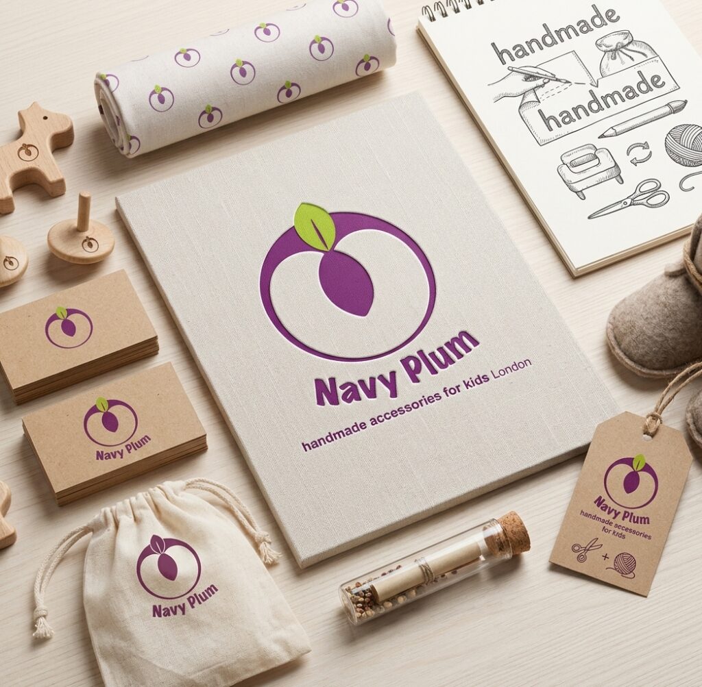
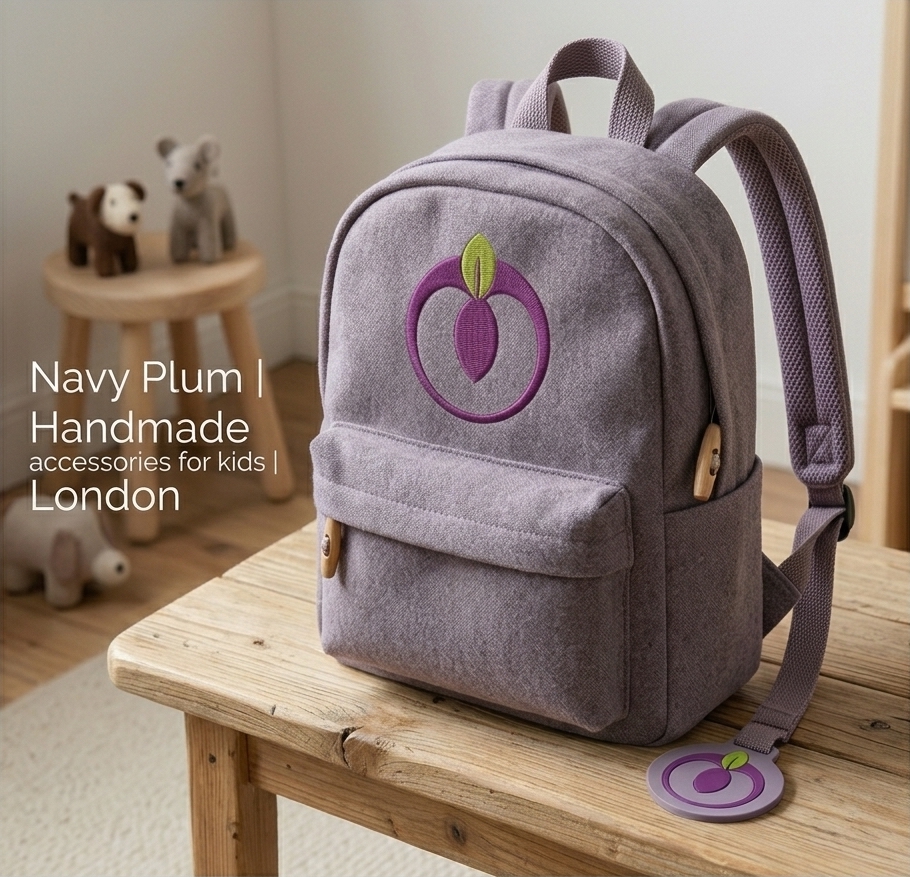
Navy Plum is a London-based brand creating handmade accessories for children. The visual identity was designed to feel playful, friendly and handmade while remaining simple enough to work across different applications.
Logo Concept
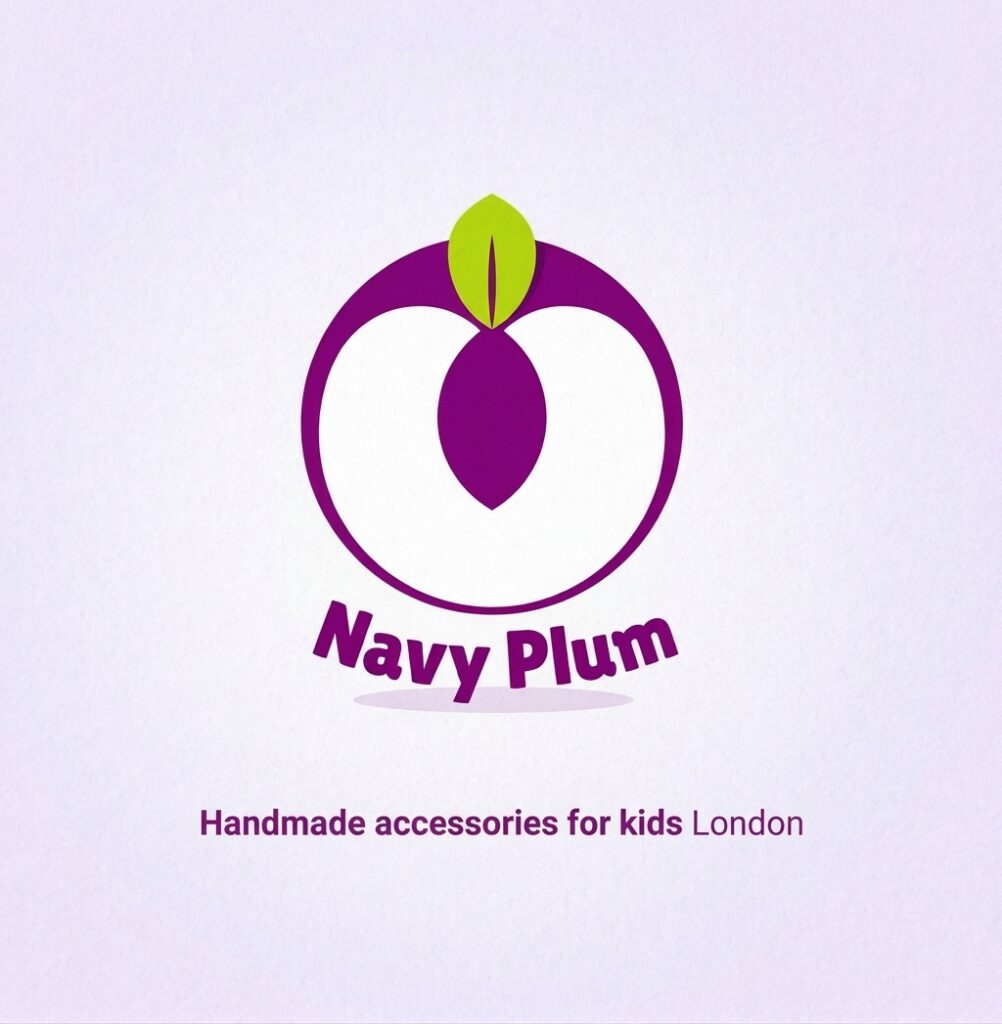
The logo is built around a simplified plum shape, using the fruit as a direct visual reference to the brand name. The rounded form gives the mark a soft and approachable character, while the leaf adds a fresh contrasting detail.
The combination of purple and bright green creates a cheerful, youthful palette suited to a children’s accessories brand without becoming overly childish.
Visual Language
Simple shapes and bold colour make the identity easy to recognise and flexible in use. The slightly playful typography complements the organic symbol and gives the brand an informal, handcrafted personality.
Comments are closed.
Antoine de Saint-Exupéry
In anything at all, perfection is finally attained not when there is no longer anything to add, but when there is no longer anything to take away, when a body has been stripped down to its nakedness.