Research Collective is a usability research company focused on observing how people interact with products and digital experiences.
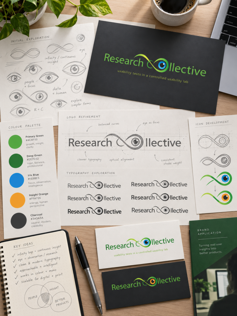
The visual identity was developed around the ideas of observation, perception and continuous research, creating a mark that feels analytical while remaining approachable.
Logo Concept
The logo combines an eye symbol with a continuous looping form, referencing both observation and the ongoing nature of research.
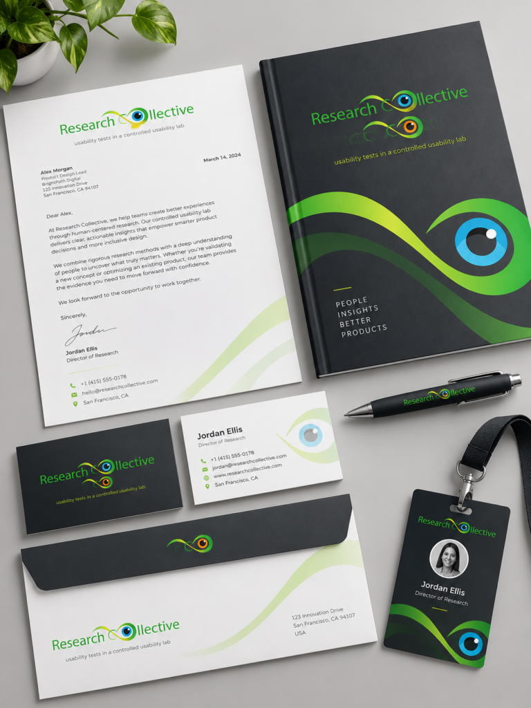
The eye becomes the central point of focus, while the surrounding shape suggests connection, movement and repeated testing. The use of different colour variations allows the identity to remain flexible while preserving a consistent visual structure.
Visual Language
The identity uses a simple, recognisable symbol paired with clean typography. Green forms the main visual base, while accent colours highlight the eye and introduce variation.
The result is a professional but accessible identity suitable for research reports, presentations, usability studies and corporate communication.
Comments are closed.
Antoine de Saint-Exupéry
In anything at all, perfection is finally attained not when there is no longer anything to add, but when there is no longer anything to take away, when a body has been stripped down to its nakedness.